Click here for code
knitr::opts_chunk$set(
  fig.width = 10,
  fig.asp = 0.618,      # the golden ratio
  fig.align = "center"  # center align figures
)Mitch Harrison
In celebration of Pride Month, this week’s TidyTuesday provides data from the Campus Pride Index, which measures the safety and inclusivity of LGBTQ+ programs across universities in the United States.
Each university is binned into one or more categories (e.g., military colleges, private/public, and others). What feels natural to me is to see how the Campus Pride Index compares across some of these categories. A proportionate stacked bar chart (where each bar has height equal to 1) is one option, but I would also like to see which types of universities are most common. If there are some categories with worse scores but with much smaller sample sizes, that would be helpful to know. So we’ll use a stacked bar, but not normalize the bar so we can also see how common each type is. Also bear in mind that a single university can (and often does) fall into multiple categories.
Let’s set some global settings so I don’t have to worry about aspect ratio or other trivialities while we work.
Time to load the data.
library(tidyverse)
library(gglgbtq)
library(ggchicklet)
library(ggthemes)
library(DT)

# load the data ----------------------------------------------------------------

pride_schools <- read_csv(paste0(
  "https://raw.githubusercontent.com/rfordatascience/tidytuesday/master/data/",
  "2024/2024-06-11/pride_index.csv"
))

pride_tags <- read_csv(paste0(
  "https://raw.githubusercontent.com/rfordatascience/tidytuesday/master/data/",
  "2024/2024-06-11/pride_index_tags.csv"
))

datatable(left_join(pride_schools, pride_tags))
First, let’s format the data for ease of plotting. Right now, each category has its own column, with TRUE or NA values, where NA means “false” for our purposes. But we want the type of school to be represented in a single column so we can map that column to the color of the bars. To move multiple columns into a single one, we will pivot the data. Since we want to consolidate columns, we will need to make our data longer (i.e., add more rows), where each university now has multiple rows corresponding to TRUE or FALSE. Intuitively, to pivot the data longer, we use the pivot_longer function. Notice that once the pivot is complete, we only want to keep the rows where the value is TRUE, since the FALSE rows are just saying that “this university doesn’t fall into this type,” which is useless noise in our dataset.
# format data for plotting -----------------------------------------------------

uni_types <- pride_schools |>

  # join both datasets into one
  left_join(pride_tags) |>

  # select which columns we want to analyze along with their ratings
  select(rating, public, private, community, liberal_arts, technical,
         religious, military, hbcu, hispanic_serving, aapi_serving,
         other_minority_serving) |>

  # replace NA with FALSE
  mutate(across(everything(), ~ replace_na(., FALSE))) |>

  # do the pivot
  pivot_longer(cols = !rating, names_to = "type") |>

  # drop the rows that don't apply
  filter(value == TRUE) |>

  # clean up some strings for prettier plotting
  mutate(
    type = str_replace_all(type, "_", " "),
    type = str_to_title(type),
    type = str_replace(type, "Aapi", "AAPI")
  )

datatable(uni_types)
That looks just like we wanted it to. Now that our data is formatting, we can work on the plot. Per the data dictionary on the TidyVerse GitHub repository, we know that fractional scores are possible. A quick call to the unique function told me that the “fractional” scores are only half-stars, not any decimal in between two scores. So 1 and 1.5 are possible scores, but 1.7 is not. We should bin these scores by their leading digit so we have five possible fill values instead of ten. We’ll call these bins rating_levs, or “rating levels.”
I would also like to order the bars in descending order of the total number of universities of that type. To do that, we’ll count how many of each category there are and save the order as a vector uni_levs, or “university levels.”
For our last data wrangling step, we can assign the rating bins to their respective ratings. I’ll create a new column for this and call it score. After that, we can group by type of university and score, and count the number of occurrences of each group. Then, we’ll be ready to plot.
uni_types <- uni_types |>

  # assign bins to the score variable
  mutate(
    score = case_when(
      rating < 2 ~ rating_levs[1],
      rating < 3 ~ rating_levs[2],
      rating < 4 ~ rating_levs[3],
      rating < 5 ~ rating_levs[4],
      TRUE ~ rating_levs[5]
    ),

    # order the score bins using the rating_levs we made earlier
    score = factor(score, levels = rating_levs)
  ) |>

  # count the number of each type/score combination
  group_by(type, score) |>
  summarise(count = n(), .groups = "drop") |>

  # reorder the universities by descending order of number
mutate(type = factor(type, levels = rev(uni_levs)))Now that we have our data, let’s get the skeleton of the plot going. I’m going to use a favorite “cheat code” of mine for making aesthetically pleasing bar graphs in R: the ggchicklet package. It lets us round the corners of each bar, which gives a much more aesthetic appearance (in my opinion). So, instead of using the geom_col function that is standard, we will use geom_chicklet instead.
One small note for geom_chicklet: it prefers to have bar graphs be vertical. But because my category names are long (and you never want to rotate text), I would like the plot to be horizontal. So I’ll map the type to the x axis and the counts to the y axis like geom_chicklet prefers, but I’ll use coord_flip afterwards to make it horizontal. This is the same technique that the author of the ggchicklet package uses in his demo on the ggchicklet GitHub repository.

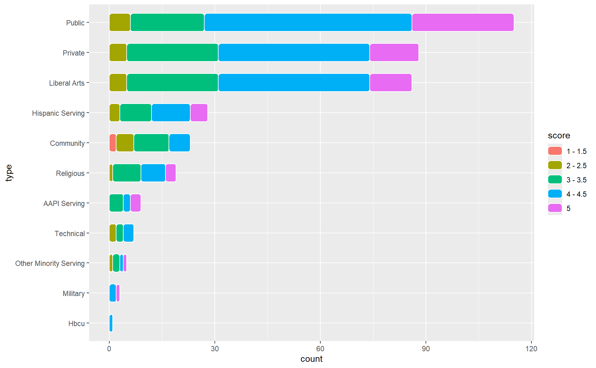
This is already a great start! We have some aesthetic changes to make, but our bins and bars are in the order that we were hoping. Let’s change some colors.
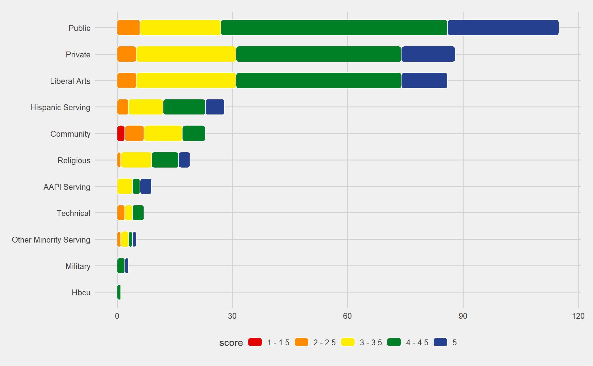
First, I’ll use my favorite theme function, which comes from the ggthemes package. That theme is theme_fivethirtyeight, which takes its name from the legendary data visualizations of the FiveThirtyEight website.
I also think it would be appropriate for us to use Pride colors, don’t you? Of course, there is an R package for that: the gglgbtq package, which I imported earlier. We will use the “rainbow” color palette provided by gglgbtq to color our bars.
uni_types |>
  ggplot(aes(x = type, y = count, fill = score)) +
  geom_chicklet(position = position_stack(reverse = TRUE), width = 0.6) +
coord_flip() +
# change theme and base font size
theme_fivethirtyeight() +
# change bar colors and put the legend in the right order
scale_fill_manual(values = palette_lgbtq("rainbow"))
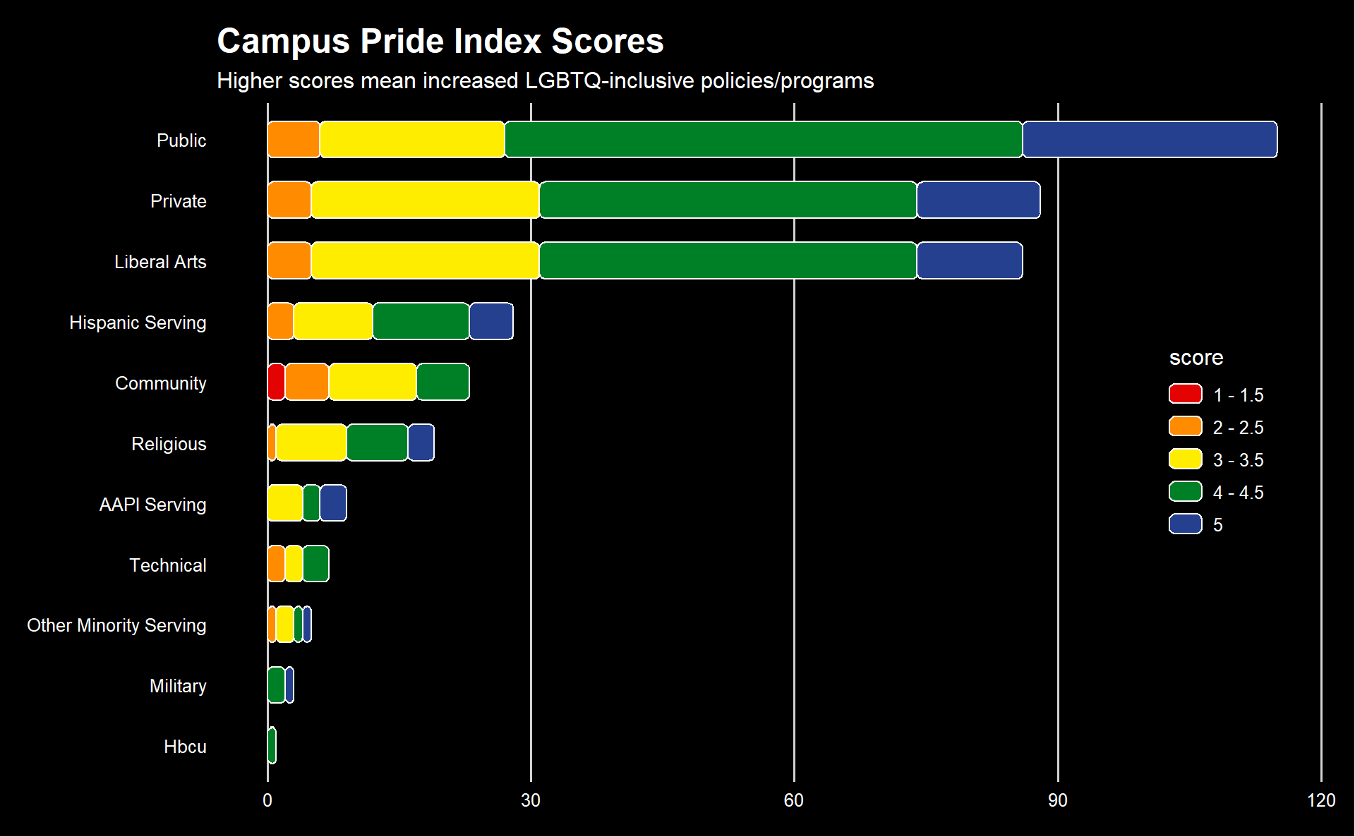
Now we’re cooking! I think we are safe to add the title and subtitle, and then we can make a few more aesthetic changes before wrapping up. I want the background to be black (personal preference), which means the text needs to be white. I also don’t think that horizontal grid lines are necessary when the y axis is discrete, so we will remove those. I love the legend, but I would like it to be stacked and placed vertically in the plot, rather than horizontal and below the plot.
uni_types |>
  ggplot(aes(x = type, y = count, fill = score)) +
  geom_chicklet(position = position_stack(reverse = TRUE), width = 0.6) +
  coord_flip() +
  theme_fivethirtyeight() +
  scale_fill_manual(values = palette_lgbtq("rainbow")) +

  # add title and subtitle
  labs(
    title = "Campus Pride Index Scores",
    subtitle = "Higher scores mean increased LGBTQ-inclusive policies/programs",
  ) +

  theme(
    # make all text white
    text = element_text(color = "white", family = "Lato") ,

    # adjust title font size
    plot.title = element_text(),

    # make background black
    plot.background = element_rect(fill = "black"),
    panel.background = element_rect(fill = "black"),
    legend.background = element_rect(fill = "black"),

    # remove grid lines
    panel.grid.major.y = element_blank(),

    # move legend
    legend.direction = "vertical",
    legend.position = c(0.9, 0.5),
  )
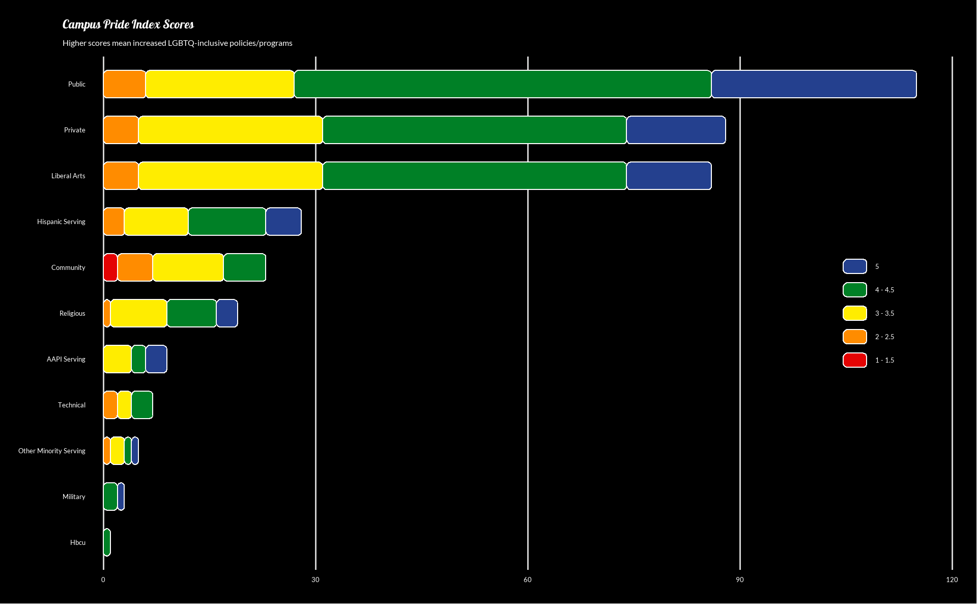
Much better! Only a few small edits left. First, I don’t think the legend needs a title. I also want the higher scores to be higher on the legend, so we can reverse the order of the legend inside of the scale_fill_manual function. The y axis text is a little far from the axis for my liking, so we will shift that in, and we’ll be done, save for one more thing: fonts.
I’m going to use custom fonts that aren’t shipped with R or ggplot. These fonts come from Google Fonts, and we will need to use two packages to get them to work: sysfonts to load fonts from Google and showtext to get them to work with our plots. Once we import them, we can use them like any other font in our ggplot graphs!
# load fonts from Google Fonts into our project
sysfonts::font_add_google(name = "Galada")
sysfonts::font_add_google(name = "Lato")
showtext::showtext_auto()

uni_types |>
  ggplot(aes(x = type, y = count, fill = score)) +
  geom_chicklet(position = position_stack(reverse = TRUE), width = 0.6) +
  coord_flip() +
  theme_fivethirtyeight() +
  scale_fill_manual(
    values = palette_lgbtq("rainbow"),
    guide = guide_legend(reverse = TRUE) # reverse the legend order
  ) +
  labs(
    title = "Campus Pride Index Scores",
    subtitle = "Higher scores mean increased LGBTQ-inclusive policies/programs",
  ) +
  theme(
    # use Lato font from Google for all text
    text = element_text(color = "white", family = "Lato") ,

    # use Galada font from Google just for the title
    plot.title = element_text(family = "Galada"),

    plot.background = element_rect(fill = "black"),
    panel.background = element_rect(fill = "black"),
    panel.grid.major.y = element_blank(),
    legend.background = element_rect(fill = "black"),
    legend.title = element_blank(),
    legend.direction = "vertical",
    legend.position = c(0.9, 0.5),

    # shift y axis text closer to the margin
    axis.text.y = element_text(margin = margin(r = -20))
  )
Done! With some data wrangling and some nice themes, we have arrived of a graph that we can be proud of (get it?). I hope this helps you in your own data viz journey, but if you have further questions, feel free to join my Discord server and ask me personally! And if you are feeling grateful for my work (and are financially able to), you can give me a special thanks by buying me a coffee.
As always, thanks for reading, and see you next week!